ACE
ACE
Client:
Client:
Client:
ACE
ACE
ACE
Service:
Service:
Service:
BRANDING


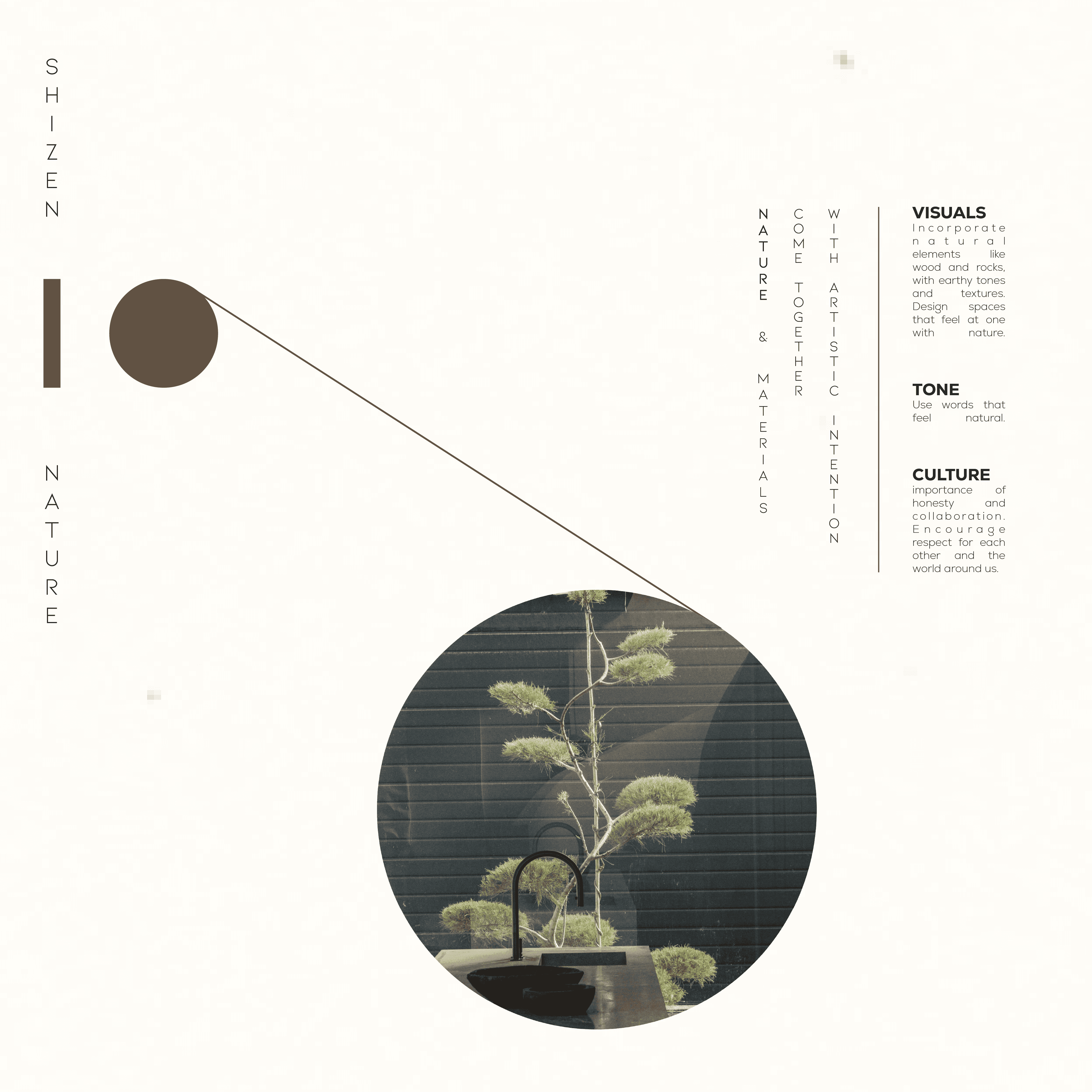
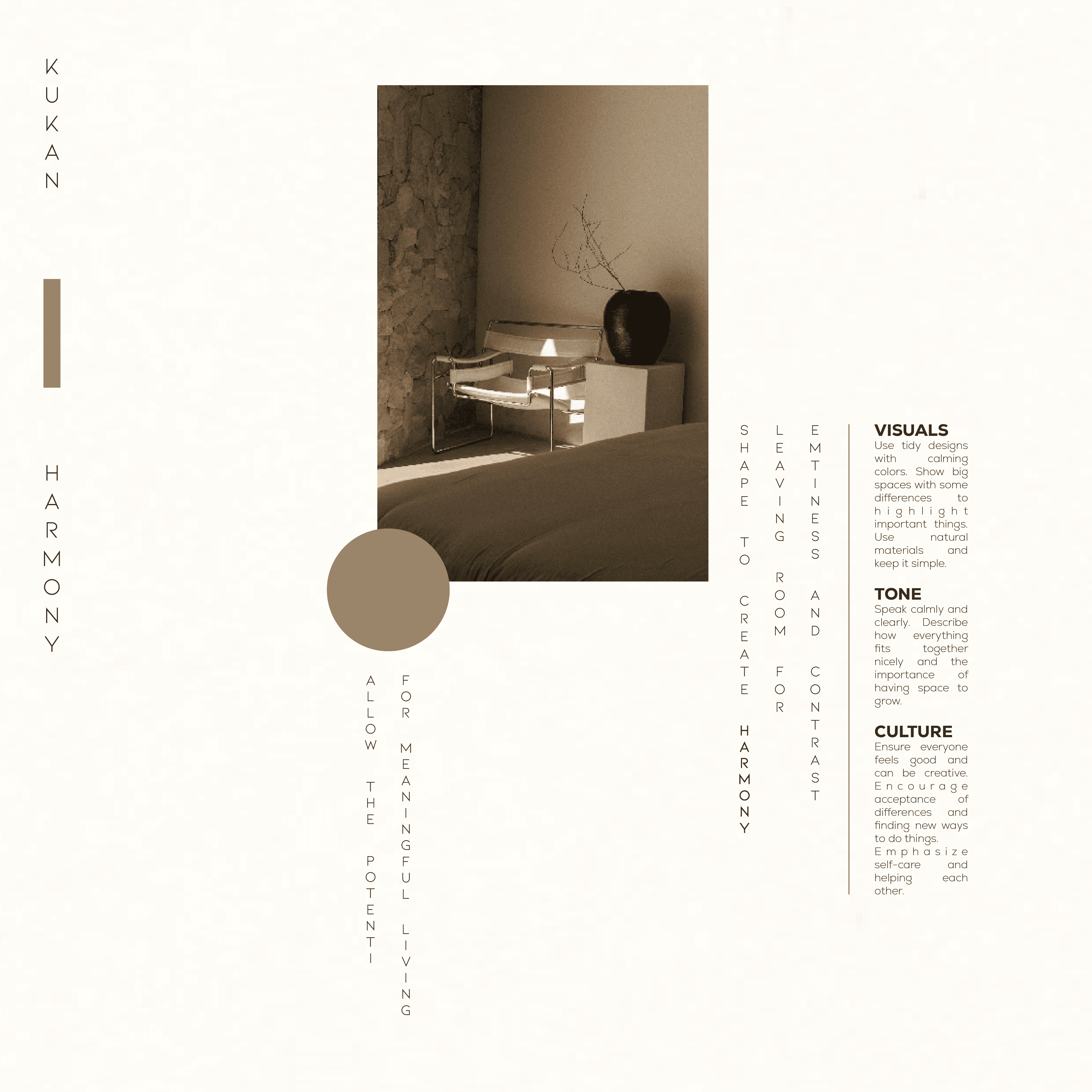
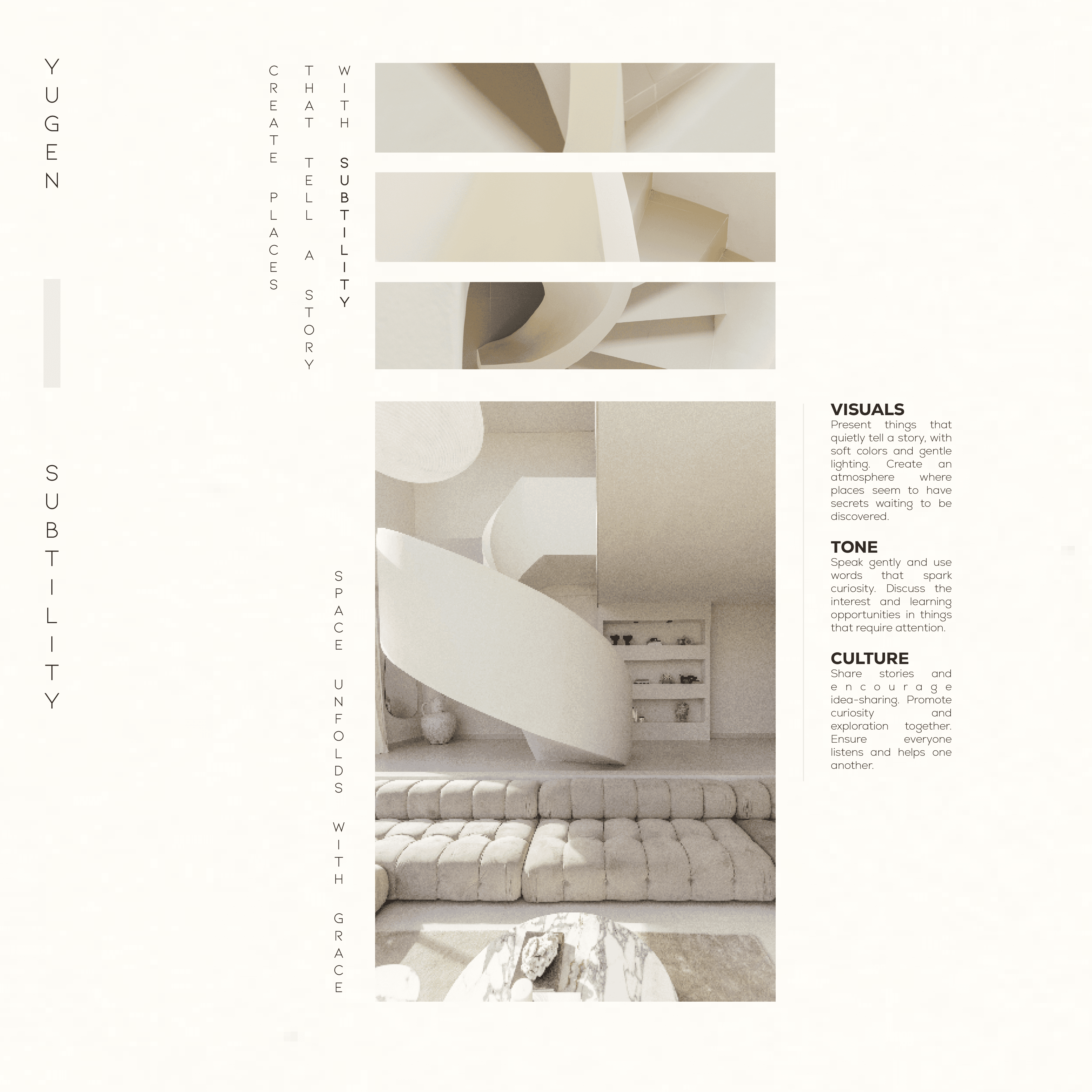
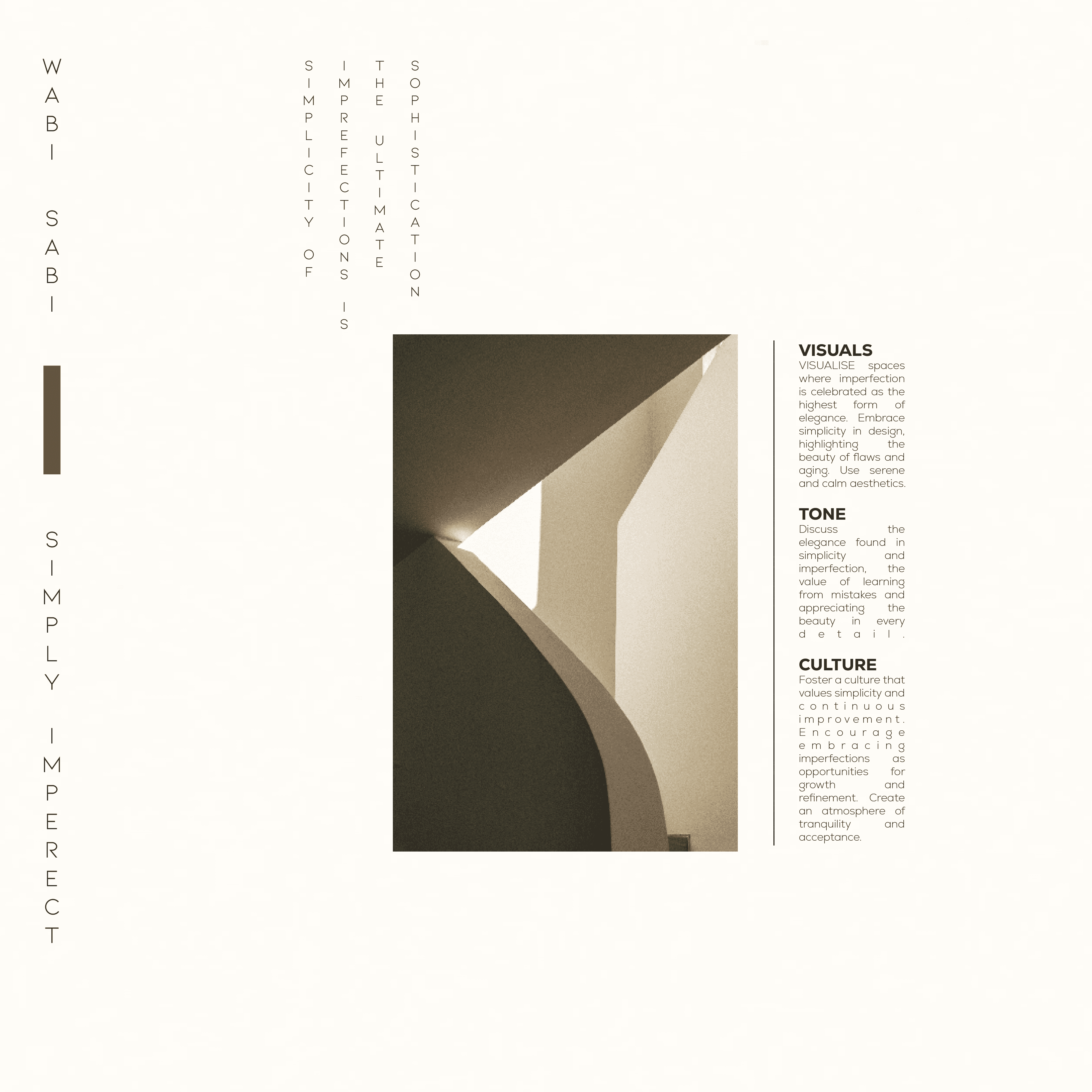
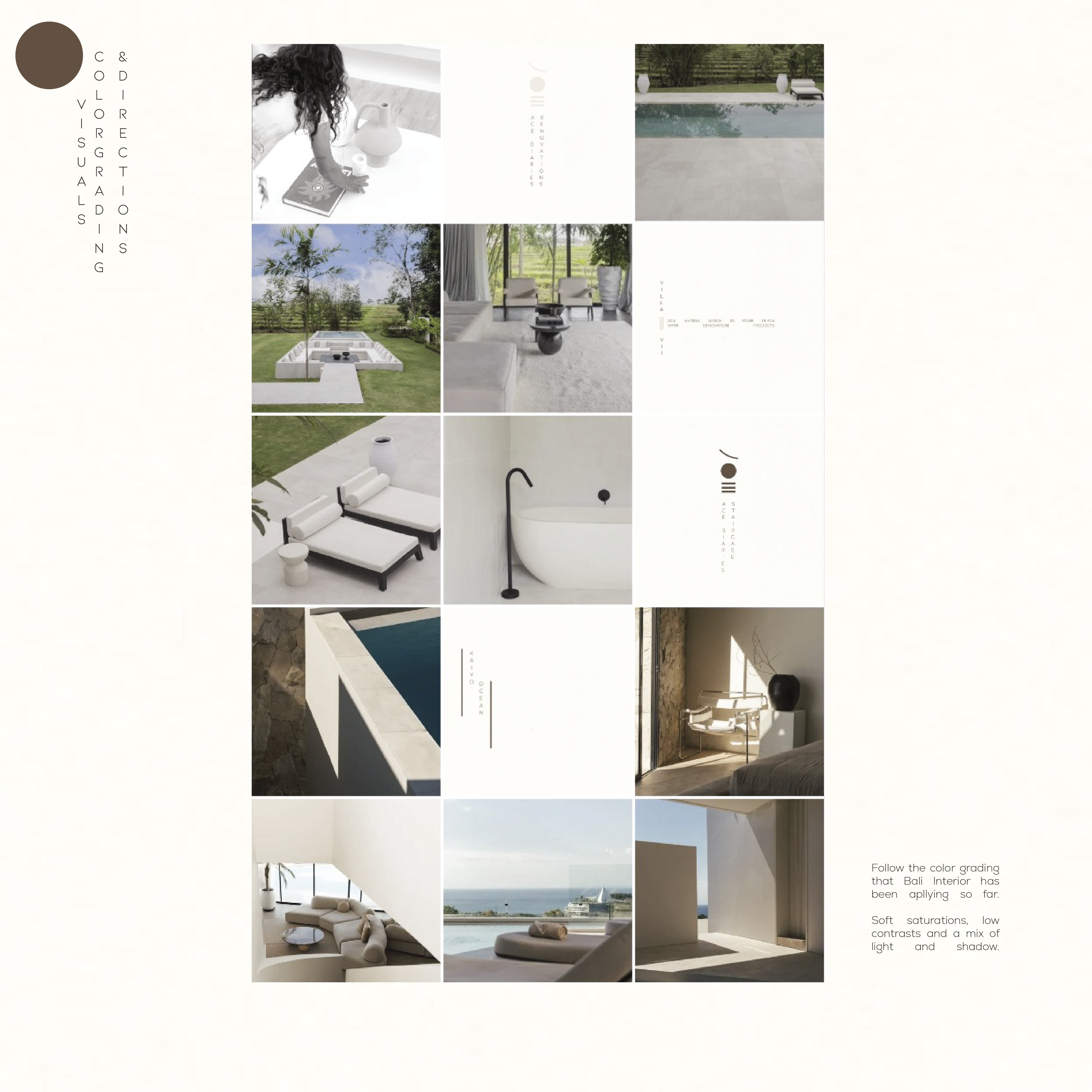
Ace Studio, an architect studio based in Bali, needed a rebrand to reflect their ethos. I designed a completely new look and feel for their brand identity, drawing inspiration from Japanese Zen philosophy. The guiding principles: shizen (naturalness), kukan (space), yugen (subtle mystery), and wabi-sabi (beauty in imperfection), became the foundation of their creative direction.
The brand baseline I added to it is a good representation of the concept for their brand, “a place for space,”. It’s about creating environments that feel harmonious, breathable, and livable. Ace Studio’s designs have that way of designing where their 'spaces' feel both functional and peaceful. I reflected this in their visual identity by intentionally leaving space, both visually and conceptually, to mirror their architectural philosophy.
